
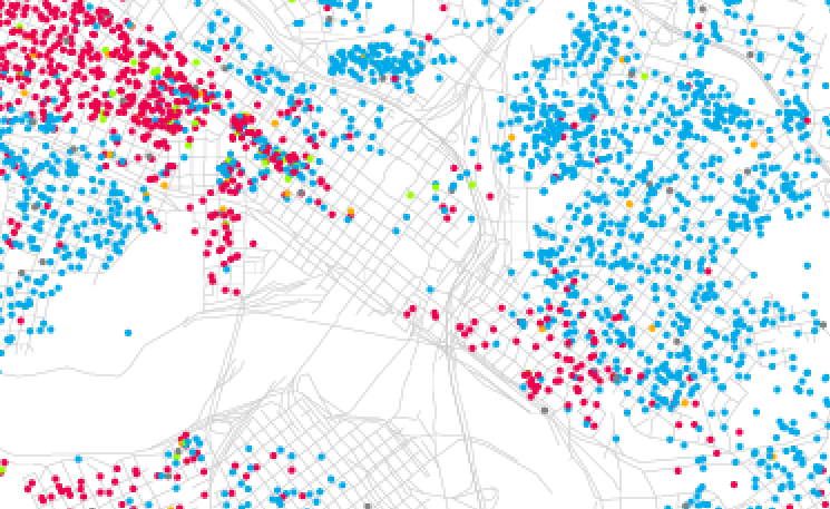
Eric Fischer has made visual the ethnic/racial layout of Richmond (2000 census data), part of an amazing set of 95 cities.
I was astounded by Bill Rankin’s map of Chicago’s racial and ethnic divides and wanted to see what other cities looked like mapped the same way. To match his map, Red is White, Blue is Black, Green is Asian, and Orange is Hispanic, and each dot is 25 people. Data from Census 2000.
Previously:
- Richmond population distribution 1923
“A detail from a 1923 City of Richmond Public Works map that upon which the darker areas ‘indicates location of colored population’.” - Richmond population distribution 1930
“Issued 1931, produced by the Department of Public Works Bureau of Survey and Design. Each dot represents 25 people.”
Thanks to Hills and Heights for the heads up.
3 comments
very fascinating, thanks for posting this
Very cool! So much much to think about in a bunch of dots.
The Eric Fischer “race in the city demographic maps” got a very quick public airing during the Cartoon Channel’s Adult Swim, on 9/28.